Product Design
Agency
Design + Dev
Reflecting on 2023: Product Design Showcase
Worked on multiple features that had an remarkable impact on users. In this article i talk about my top 5 projects that i have taken up and delivered end to end.
As the sun sets on 2023, Reflecting on an amazing year as a product designer working with Nxtwave, an innovative force in the Edtech industry, that has provided a productive ground for creativity and problem-solving. This article serves as a demonstration of the projects that have not only defined my professional growth but have also left a lasting impact on the users we serve.
Why This Review?
Before we dive into the details, let me tell you why a year-end review is essential. Beyond the routine evaluation, it’s an opportunity to acknowledge achievements, learn from challenges, and celebrate the collective effort that went into bringing our designs to life. It’s a chance to appreciate the evolution of our skills and strategies.
Lets Start!
I have taken five projects from my last year’s work and will talk about these projects in brief. The flow of these projects might seem simple and short to you, but trust me, a lot of discussions and brainstorming take place behind the scenes just to reach and deliver the optimal solution.
Each project adheres to the established design process at Nxtwave.
All the projects that I am going to talk about followed the same steps in terms of the design process, so let me brief you on the process itself, as it is common to all the tasks and projects listed below.
Lets Have a look on my Design Process🖌️
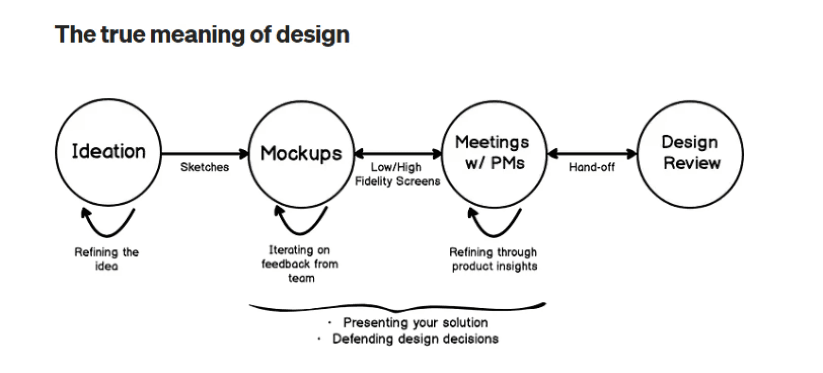
Overall, this Visual sums up my design process and in 50% of the tasks where research is not required, this is generally what we follow, but if we talk about a more systematic approach that we follow at Nxtwave, then this is it👇
1. Empathize
As a usual drill, it starts with questioning the problem statement itself. Is this really a problem? once I am completed with my “why’s?” I get a clear understanding of user problems. During this phase, we try to interact with users to get to know their real problems. Sometimes we already have user recordings or user queries from which we can extract insights.
2. Define
After I am done with the getting to know the user problem part, a design objective is made. The purpose of this step is to define a clear goal for what needs to be done. Before making a clear-cut objective, we usually do a comparative analysis and see what other platforms are doing.
3. Low-fidelity designs (Ideation)
I started keeping the design objective in mind. Usually, in this phase, I try to create rough sketches or digital low-effort designs and try to fix the user flow first. When we are developing these low-effort designs, we keep the scalability factor in mind and try not to create something that would be difficult to create for different device sizes, such as mobile or tab. All the iterations happen here; multiple design iterations build over the previous version. Once all stakeholders are aligned on the flow, we fix it and then move on to high-fidelity designs.
Before next step Design review and PM review happens, if changes are there then designs are iterated otherwise we move to next step.
4. High-Fidelity Design (Deliver)
Once the flow and the low-fidelity designs are fixed and all stakeholders are on the same page,. We take those designs as a base and then try to upscale them in terms of aesthetics. In this process, a lot of basics also take place, like keeping in mind the design language and style of our product. Ensuring component and style linkage to the design system. Arranging files so all the stakeholders viewing the file understand the flow with all the edge cases covered
Again Design review happens followed by PM review.
5. Test
Usually, the designs of any feature are tested before development with real users. but often, whenever we create designs, they are rolled out to a small set of users who use the feature. During this time, we track certain parameters to validate our designs, and feedback is also collected from users for the same. This process of continuous iteration on user-centric feedback is what makes the product or feature more likeable and adoptable by users.
Designers test the design when it is in prod to see any inconsistencies in the developed version compared to designs
Now lets start with the projects
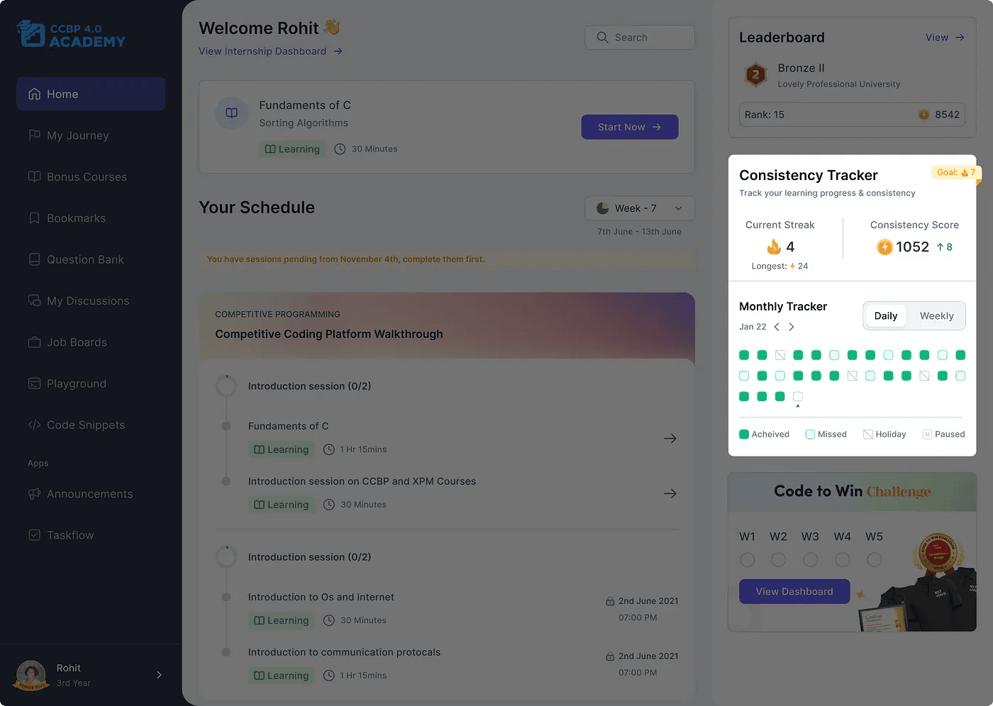
Project 1: My journey🚩
✨ Why was the project started?
We were receiving multiple queries every month from users who wanted to know where they stood in the whole journey and what their current progress was. Currently, our product is incapable of letting users know that they have finished “x” number of courses or “x%” of their course. This was due to the fact that we have a complex content hierarchy and no dedicated space for the user journey.
✨ Diving Deep
For this feature, we had user recordings, which were already done by the product manager. I went through the recordings to collect actionable insights. Also, comparative analysis was very helpful here, as we were able to take references from products that were the right fit for our feature. We wanted the user to have a dedicated space where he could see all his progress, including individual course progress.
✨ Design Objectives
Design a space where the user can see all of his learning content. He should be able to track the progress of his learning and see what the milestones are in the journey.
✨ Approach
This whole feature of “My Journey” was so significant that it had been kept under a primary tab in the navbar. Regarding the main screen, we made cards that displayed course information with other course-relevant secondary information. When you click on the course card, a modern side overlay opens with the course overview. This modern overlay with rounded corners and a floating style is a recent design trend. You can see the whole design here.
<div style="position: relative; padding-bottom: 56.25%; height: 0;"><iframe src="https://www.loom.com/embed/f3bf073fb6794657b53196e4bc6e8b74?sid=54246eb4-3605-404f-b605-0d3970b06631" frameborder="0" webkitallowfullscreen mozallowfullscreen allowfullscreen style="position: absolute; top: 0; left: 0; width: 100%; height: 100%;"></iframe></div>
✨ What Did It Impact?
The number of user queries per month went down to 4–5 from 50–60 regarding user progress in the program. That’s a 90% reduction Also, the customer support team had fewer doubts when asked about the program and growth cycles.
✨ Takeaways and learnings:
Spend most of the time figuring out low-fidelity sketches using different layouts. Once all stakeholders are aligned, move to high-fidelity designs.
As a product designer, it is your responsibility to ensure that your users are always aware of the content they are interacting with. He should have visual cues; if your product has a lot of levels of content hierarchy, everything should be properly labelled.
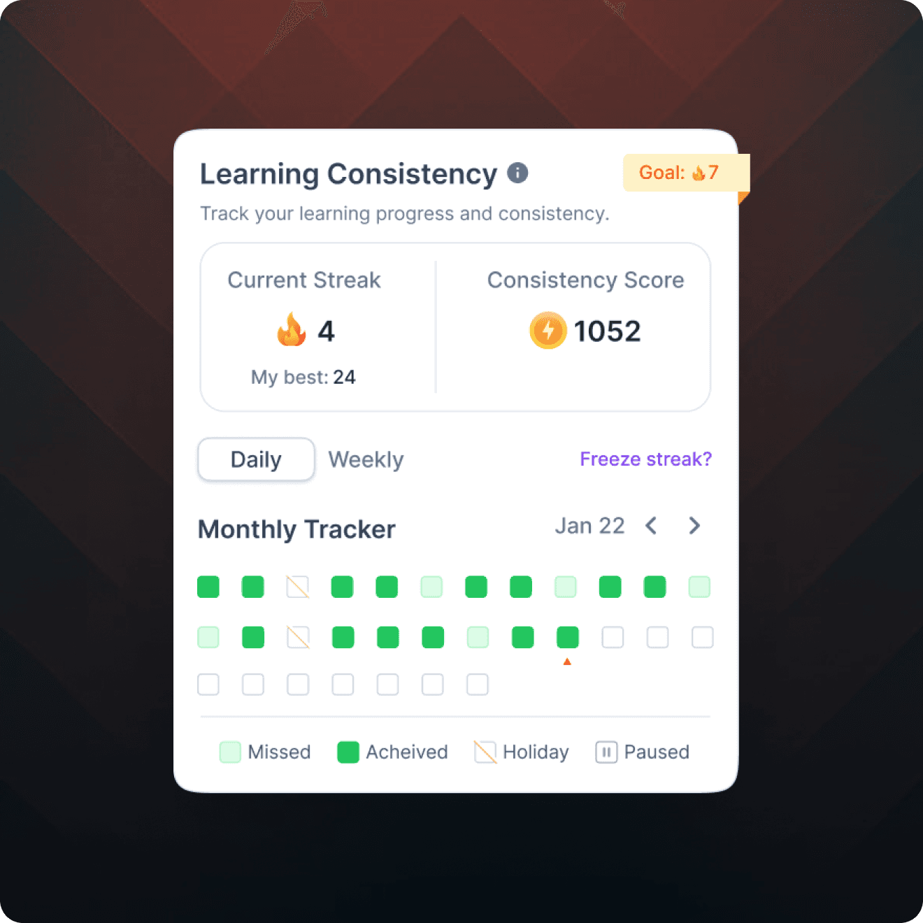
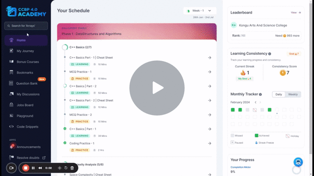
Project 2: Consistency tracker (Streaks)🔥
✨ Why was the project started?
We saw a sudden decline in our daily active users and a decrease in user engagement. To address this issue, we needed to improve the DAU%.
✨ Diving Deep
There were a few reasons that contributed to this lack of motivation for users to come to the platform. Some user calls were done in order to get to know the user better, and the findings pointed out that users do not feel motivated enough to come to the platform and learn daily due to personal and academic reasons. We looked back into our product to see what a user might be missing, and we felt that since quite some time, no new feature has been introduced, even though we were not tracking user usage frequency and consistency.
✨ Design Objectives
Set up a way for users to measure consistency on the platform, fostering daily usage and habit formation.
✨ Approach
I started seeing gamification references to comparative products to see what users expected because of the Mere Exposure effect. I read multiple articles, and one such insight that took us towards streaks is that products like Duolingo have leveraged the power of streaks to boost their DAU significantly. After our ideation, we came up with wireframes, tested them with users, iterated on feedback, and then came up with the version that was ready to go. If you want an in-depth process for this feature, I already have an article on it that you can read here.
✨ What Did It Impact?
DAU% for users with Consistency Tracker increased by 6%, and usage frequency also increased.
✨ Takeaways and learnings:
Leverage the power of psychological laws. Understand how you can use it for your benefit.
During the ideation phase, explore the internet before starting the tasks. Sometimes you get resources that you need to start. It can be an article describing how someone solved the same problem, a guide, or a survey done on the feature on which you are working.
Project 3: Implementing Searchbar🔍
✨ Why was the project started?
This feature was aimed at improving the user experience, enhancing navigation, and promoting efficient access to desired resources.
✨ Design Objective
Introduce a static search bar that retrieves and displays all relevant search results.
✨ Approach
We started out this task by seeing our direct and indirect competitors that are similar to ours. Also before starting out this task we looked into a few articles written over the implementation of the search bar in other ed tech products. We had discussions with the tech team in the initial version itself to see what limitations we have from the tech side and what constraints we need to consider while designing our features. Searchbar was kept in the home itself but when someone would search it would show the search results in a new page with different categories of result.
Revolutionizing the Job Market | NxtWave - 7 February 2024 - Watch Video
Searchbar Feature
✨ Diving Deep
When we released this feature the adoption of the searchbar feature was only 10%. this meant that either our users were not aware about the feature or the did not like it. To dig deep into this issue we planned to have user interactions and see what users need to say about this topic.
After research was conducted we got suprising insights that atleast 50% of the users were comfortable to navigate through thier preferred way. This is because of the phenomenon called “Selective Attention” which quotes People have selective attention and will only focus on the necessary journey to their objective. If it’s not important to a user’s task, users won’t care about or acknowledge it. so after the research we were ok that users are able to find their content anyhow, we are not limiting the user to use only search to find the content but we wanted to enhance the search bar functionality.
After the user interaction we iterated the designs and then rolled it out to our users.
✨ What Did It Impact?
In the V1, the adoption rate was 10%, In the V2, adoption rate was almost what we aimed for. Adoption rate increased by 10%, now it was 20% after the release however it even went to 60% because of novelty effect. Considering our edtech platform that doesn’t have a primary use case for search this increase in 10% was good.
✨ Takeaways and learnings:
Dont Assume things and start working, Its best if you interact with a real user to gain real insights about their problems and then define the objective.
Its better to discuss the tech constraints and limitations from tech side before hand and then design keeping those limitations in mind.
Project 4 — Skill Profile📊
✨ Why Was the Project Started?
Getting user queries for course exams information and exam marks. Currently, portal was not showing these grades all in a single place, if the user wants to see his performance, he has to navigate to each course exam and calculate by himself.
✨ Design Objective
To make a space for all course exams with their marks and schedule with Overall CGPA.
✨ Approach
For Skill profile, approach was simple to show all the data related to course exams in a tabular form with a CTA inside the table for upcoming exams. Also the overall CGPA was important for users to know so prominence to CGPA was given by creating a separate fixed section for CGPA. This section was navigated through the primary Navbar.
Here the challenge was of showing CTA’s too for the respective exams as the table was already filled with information but if the user has not given any exam no information would be shown so the CTA was placed in the card👇
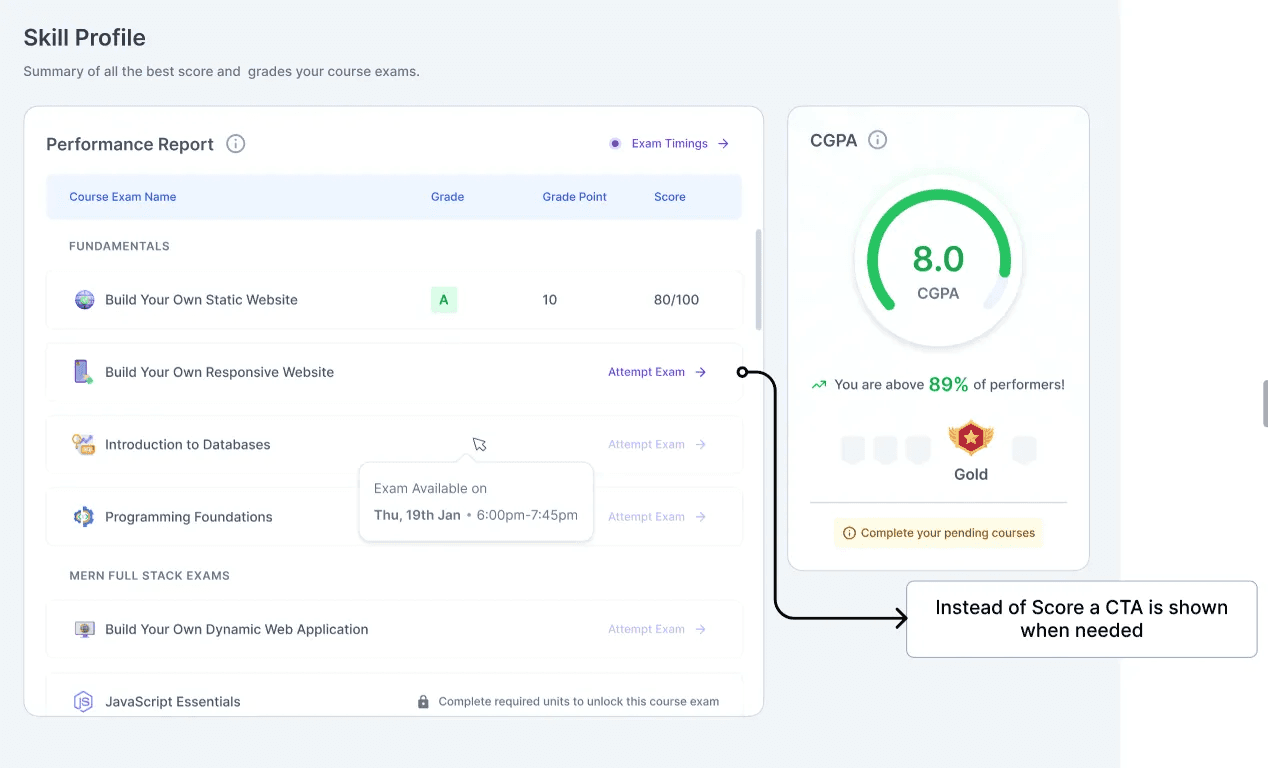
✨What did it Impact?
No. Of user queries related to course exam marks reduced significantly but still got feedback from student mentors that the students are unaware about “re-attempting” of exam. For this segment design needs to be updated with clear indication for exam CTA’s. This task is in pipeline once done the impact will be updated here.
✨ Takeaways and learnings
Real users validate your design correctly. Hallway testing can be a good option but not the right one always.
Always keep scalability in mind before designing for web. Think of how this design will look on different screen sizes and then start designing.
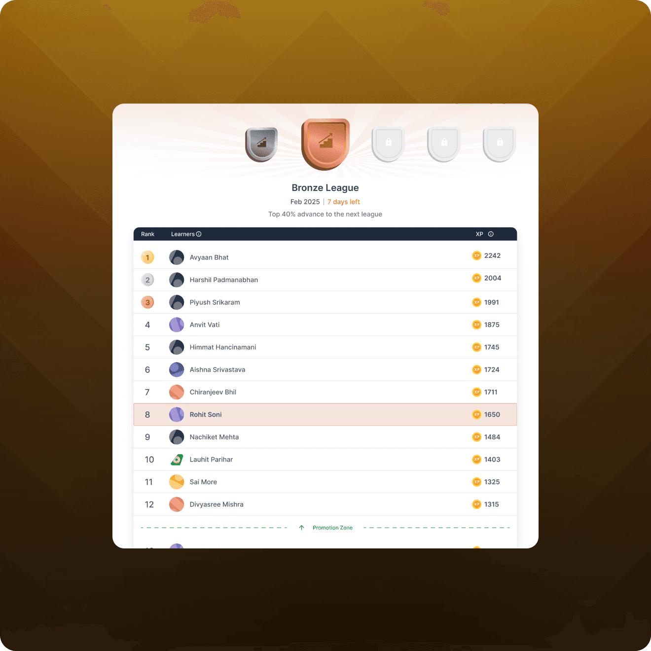
Project 5 — Leaderboard🏆
✨ Why Was the Project Started?
The objective behind adding a college leaderboard to the social learning platform is to foster a competitive and collaborative environment among college students. By implementing a leaderboard, students can track their progress, compare their performance with peers, and strive for excellence.
✨ Design Objective
Create a student leaderboard and a college leaderboard where users can see their score and Compare it with peers. Top 3 winners should feel celebrated.
✨ Approach
We saw different edtech products for refrence, gathered some pattern to start with and then created a MVP leaderboard. The layout is pretty simple with the winners priortized at the top section and a table at the bottom. Within the table the user’s card have been fixed at the top irrespective of his rank. We have two kinds of leaderboard one is student level and the other is college level and to switch a tab is given at the top. User will also earn badges based on score. So the right section have been utilised for showing the badges progress and it has been kept sticky.
✨What did it Impact?
Currently Stats for leaderboard are pending and the impact measurement will be updated here once we get the stats.
✨ Takeaways and learnings
Always see the bigger picture, Mostly a feature starts with V0 or V1 but has other versions too in the pipeline so keep the functionality of future versions in mind while designing the intial version.Dont ever miss using components in the designs because when there are lot of screens in the file and a small change has to be made, if it’s not a component you need to manually change it in every screen rather than just changing the component.
Conclusion
As I wrap up this year-end review, I am filled with gratitude for the opportunities, challenges, and victories that came our way. The projects undertaken at Nxtwave in 2023 have not only ehnanced my product design skills but have also set the stage for an exciting future.As we step into the new year, let’s carry forward the lessons learned, the triumphs celebrated, and the collaborative spirit of innovation. Here’s to another year of pushing boundaries and crafting experiences that leave an long lasting mark on the world of product design. Cheers to 2024!.